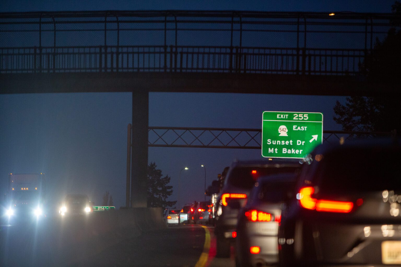
Have you ever been on a six-hour road trip to the middle of nowhere and become so bored that you wondered who designed the typeface used on road signs?
A sans serif typeface, Highway Gothic was designed in the 1940s by the United States Federal Highway Administration (FHWA) to be legible for drivers at far distances, moving at high speeds. Highway Gothic has six fonts, including a narrow and wide version, according to the FHWA.
Eventually, an opposing typeface called Clearview was developed, which nearly replaced Gothic Highway when the FHWA approved it as an alternative. Clearview was thought to be more legible; however, the studies were later debunked because the brand-new signs were simply easier to read than the old ones.
In January 2016, the FHWA rescinded its approval, but two years later, as part of the Consolidated Appropriations Act, Congress passed a bill restoring the approval of Clearview.
As a Washington state driver, you may recognize Clearview as the typeface used just north of us in British Columbia, which adopted the alternative in 2006.
WTD is published online Mondays and in print Fridays. Have a suggestion for a “What’s the Deal With?” inquiry? Email us at newstips@cascadiadaily.com.


