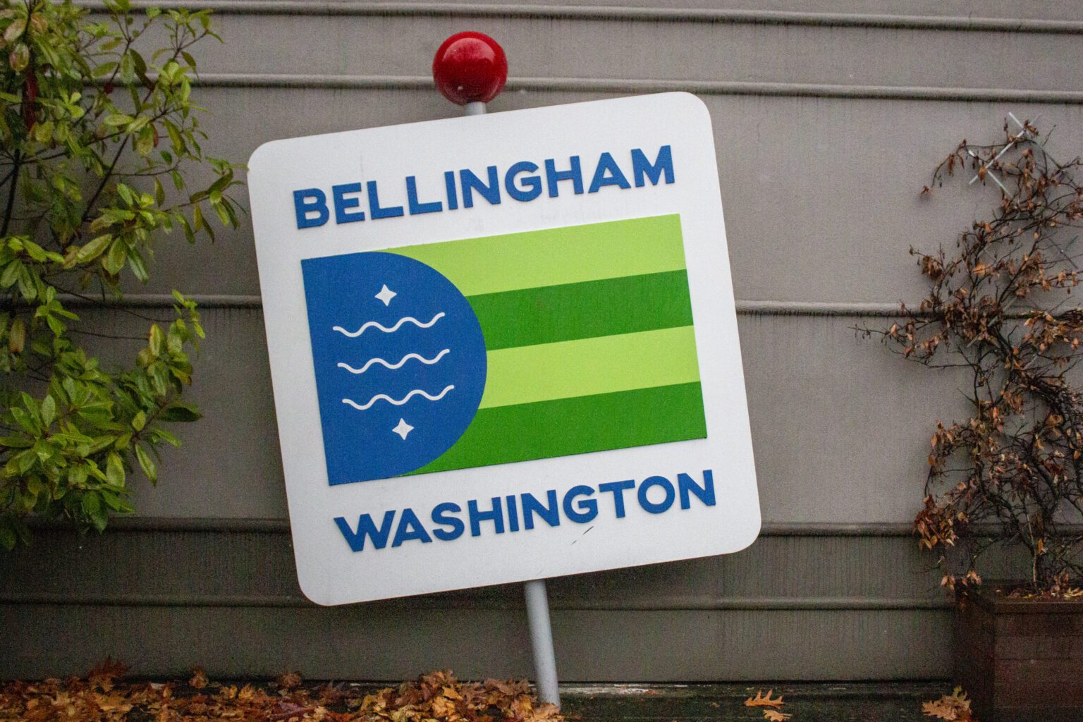
The Bellingham flag was officially adopted by the city of Bellingham on April 24, 2017. But what do those squiggly lines mean?
The blue half-circle represents Bellingham Bay. The three white, squiggly lines depict Whatcom Falls, and when flown vertically, they wave in the air like fast-flowing water. Whatcom is the Nooksack word for “noisy water” as well as the name of a former Nooksack chief.
The green stripes represent the four original towns of Bellingham: Whatcom, Sehome, Bellingham and Fairhaven.
The two stars represent the Nooksack Indian Tribe and Lummi Nation, the local Coast Salish peoples.
Bradley James Lockhart is responsible for the design and for countless other logos, including the Wild Buffalo House of Music and Cascadia Bicycle Tours. Lockhart’s work comes to life in his freelance studio, Lariat Creative.
The Bellingham Flag first took to the air in March 2016, according to Lockhart’s website, after winning an unofficial contest hosted by the Downtown Bellingham Partnership. It was used by local businesses, endorsed by the Port of Bellingham and approved by the Lummi Nation and Nooksack Indian Tribe councils before the city government recognized it.
The flag is public domain, meaning businesses can use it on their products, and many have, such as Aslan Brewing and the Community Food Co-op.
WTD runs on Wednesdays. Have a suggestion for a “What’s the Deal With?” inquiry? Email us at newstips@cascadiadaily.com.


